
The image above is a representation layer masks done during a fun class activity.
The image above is a representation layer masks done during a fun class activity.

The image above is a collage of my four selections. I wanted use the theme of Earth, Air, Fire and Water. I struggled a lot with this project and I am very disappointed with these results. I am very comfortable doing selections and layer masks but for some reason the ideas I had for this theme weren’t coming together well. I am 100% sure that I will be doing this over. I will make improving on this assignment a personal challenge of mine. I think it will be great to see the improvement I make.
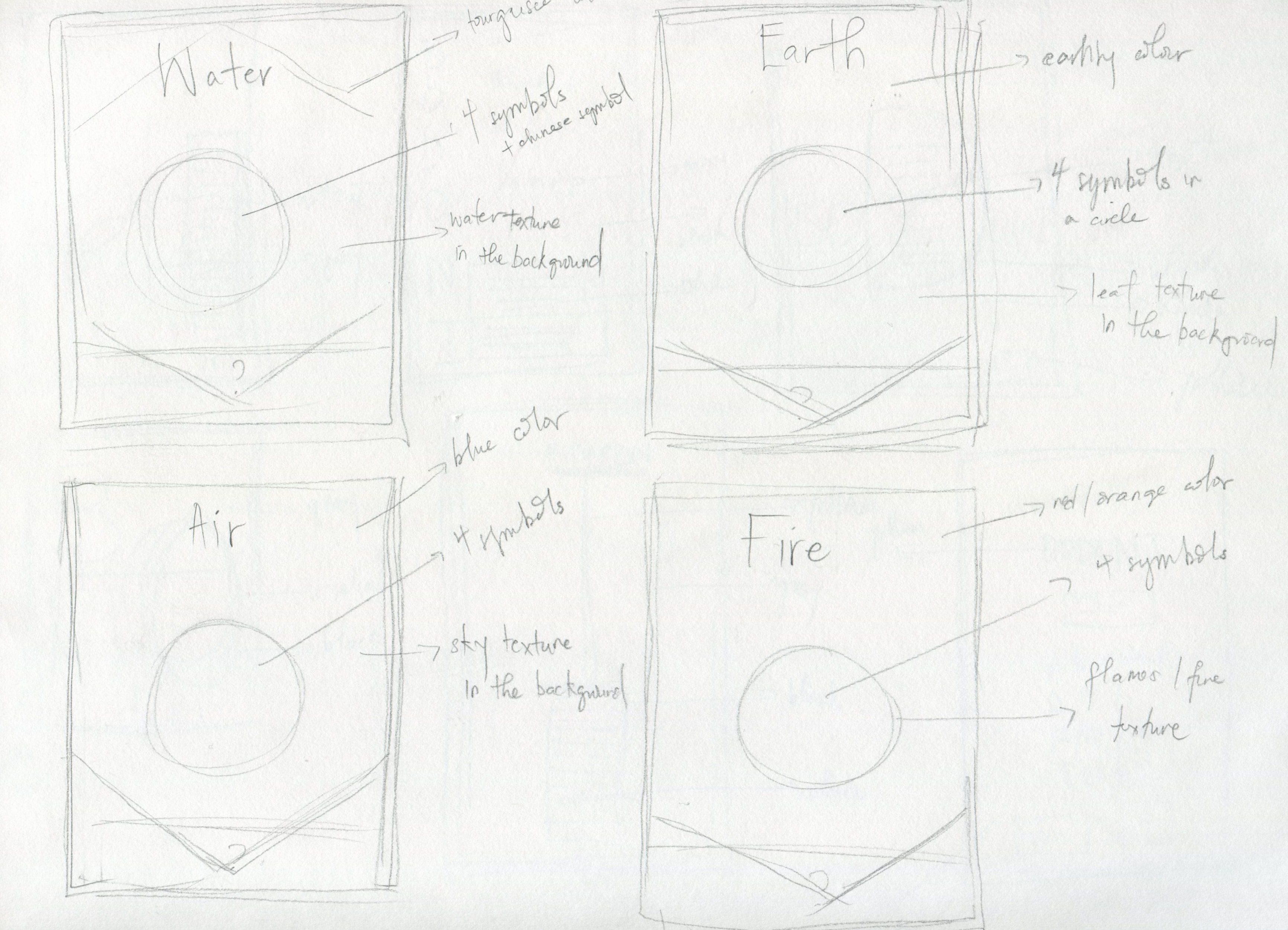
Above is an image of some rough sketches of my four selection process.
 Rhythm and Balance work hand in hand, its like the ocean and sand. As it relates to design balance activates and anchors elements. Imagine living a life without balance, there would be so much dysfunction. It’s the same with design, the design wont work if there is no balance. Weight throughout the design needs to be equal, the size, texture, value and shape of the elements in the design all come into play when you are trying to get a good balance. Rhythm is a repeated pattern, something that has a nice flow. Applying rhythm to a design surprises the eye of the viewer which is always a goal for designers. You want your viewers to feel intrigued or some sort of feeling when they view your work. Rhythm and Balance make achieving this goal more enjoyable and easier for the designers.
 Symmetry / Asymmetry and Repetition and change are ways to apply rhythm and balance .
 “Scale can be considered both objectively and subjectively.” As a designer your work should always have some sense of scale. You have to make your design look realistic in the context that it is representing. Size matters ! Things may appear work well on screen but once in print you can easily see where the size of your elements don’t work with your scale. It goes back to balance, the individual elements of your design need to be sized respectively to make the design balance.
 Texture does wonders for a design both physically and virtually. It feels feel to a design, it takes your work out of space and gives it an address. Whether that address is the concrete pavement in Times Square or the carpet in your room it adds a great amount of detail and perspective.
The images above were taken from:
Graphic Design: The New Basics. (n.d.). Retrieved February 11, 2015, from http://www.gdbasics.com/html/book.html

Point, Line and Plane are the three essential components of design. They are seen as the building blocks of each and every design. They each play an equally important role in the design world.
The first element is point. A point marks a position in space. A point is more than just a x and y coordinate, its the most important building block of the three to me as both lines and planes consist of plenty of points. A series of points form a line and a series a line form a plane so it only makes sense that point is considered the most important. In the world of typography the point is a period. The point serves as a sign of finality.
The second element is line. A line is an infinite series of points. The line is very crucial for type as it the baseline for text. Not only does text sit on this baseline but the line serves as a major aid as it relates to type alignment. A line can be a positive mark or a negative gap and can be represented in many different ways.

The third element is plane. A plane is a flat surface extending in height and width. Unlike the line, planes have breadth. The shapes we see both physical and virtually are all planes with edges. Something has undefined as a field of text is a plane. It is a plane made of points and lines.

The images above were taken from: http://www.gdbasics.com/html/point/point.html
UMD Graphic Design I Blogs. (n.d.). Retrieved February 11, 2015, from https://jgordonumd.wordpress.com/2014/01/23/page/2/
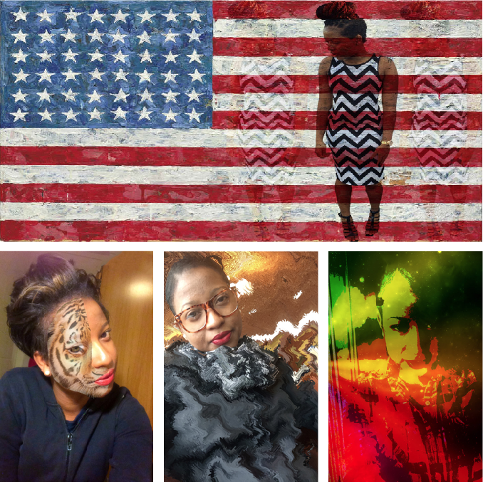
Our next task was to edit four of our selfies. For my edits I played a lot with selection and image distortion. I placed that image of myself on the American flag because I though the contrast with the pattern on my dress and the flag was interesting. For the three face shot selfies I wanted to do something very different with each of them and I love the way they came out.
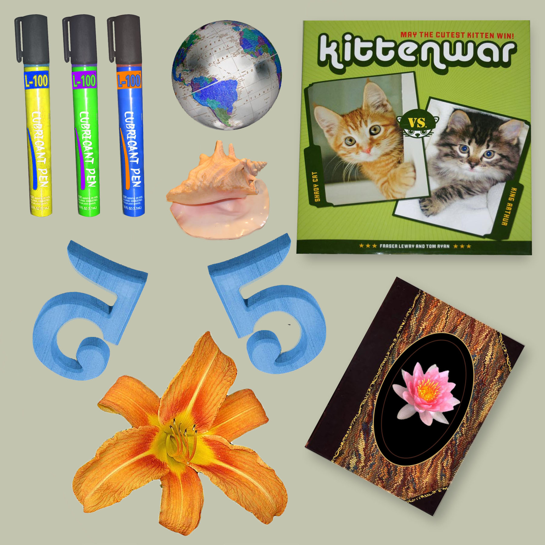
The image above is a comprised of eight different images. Each of these images were selected and copied using a different technique. Though it may seem simple and quick it took a lot of patience and precision. Each image has its own unique edges and curves which require special attention. Along with selecting and copying, some images were inverted, flipped and had a color change. The randomness of each image in this collage was on purpose. Each image required a different method of selection and it taught me how to work with different shapes.
